Accessible Beige is the go-to neutral paint color that offers warmth and versatility without overwhelming your space. Learn how to use it in every room with expert tips, ideas, and insights.
What Is Accessible Beige?
Accessible Beige is more than just a paint color—it’s a modern classic that bridges the gap between warm and cool tones. Created by Sherwin-Williams, this neutral hue is often described as a “greige” (a mix of gray and beige), but it leans more toward the warm side. Unlike many traditional beiges, Accessible Beige doesn’t come off as yellow or dated. Instead, it’s subtle, sophisticated, and blends effortlessly with almost any design style.
The beauty of Accessible Beige lies in its versatility. Whether you’re painting an entire home or just one accent wall, this color brings a calming and inviting presence. It plays well with natural light and pairs beautifully with other neutrals, deep tones, and even bold accents. From modern minimalism to cozy farmhouse aesthetics, Accessible Beige is truly a chameleon in the world of color.
Why Accessible Beige Is So Popular
If you’ve been on Pinterest or watched any recent home renovation show, chances are you’ve seen Accessible Beige in action. Its popularity has skyrocketed in recent years, and there are solid reasons why designers, homeowners, and real estate professionals are constantly singing its praises.
First and foremost, Accessible Beige is the ultimate crowd-pleaser. It’s neutral without being boring, warm without feeling heavy, and modern without going cold. That makes it perfect for homes going on the market, rentals, or even long-term personal spaces. The color adapts depending on lighting, showing off a rich depth in dim areas and a soft brightness in well-lit spaces.
Another reason for its rise in popularity is its timelessness. Unlike bold or trendy colors that can date a room, Accessible Beige has staying power. It has enough gray in its undertones to feel fresh and updated, but enough beige to still be comforting and cozy. That balance is hard to beat.
Where to Use Accessible Beige in Your Home

Living Room
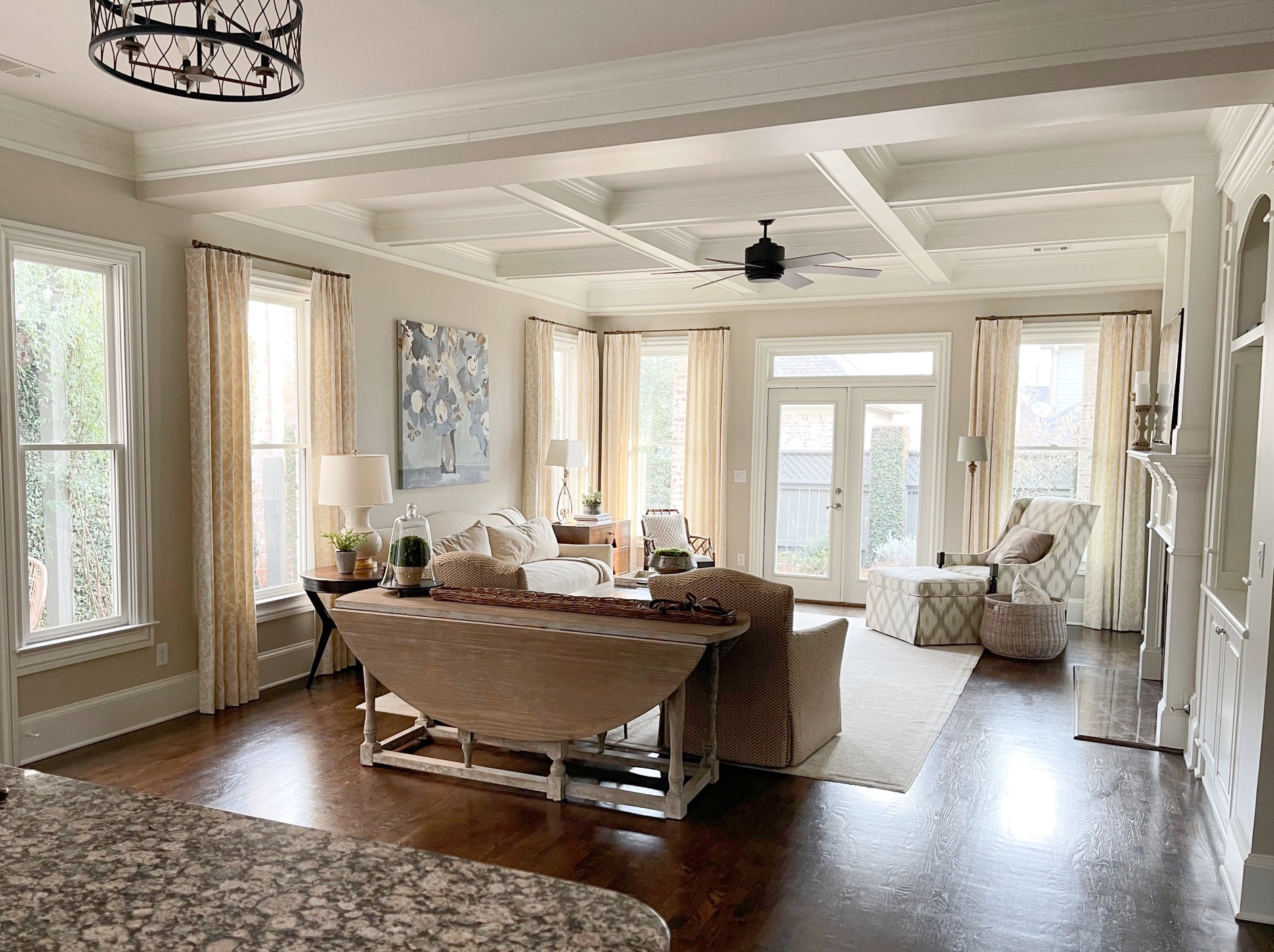
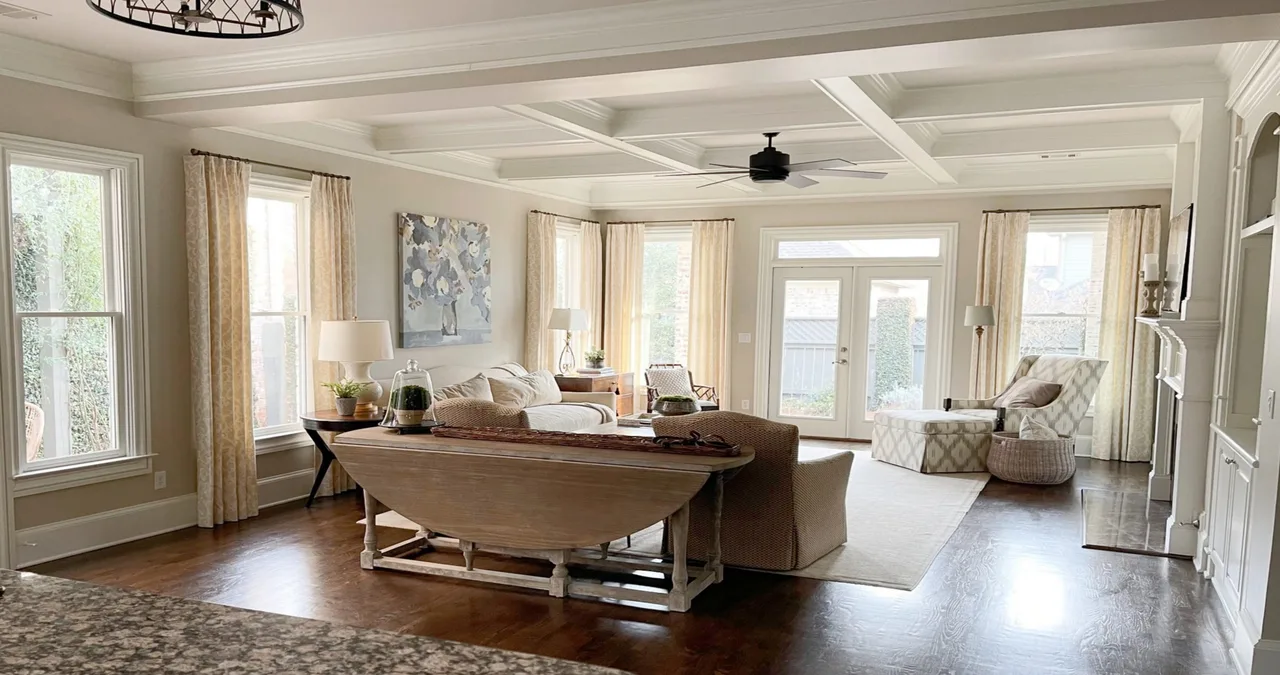
The living room is one of the best spaces to showcase Accessible Beige. This area usually benefits from large windows and varied lighting throughout the day, allowing the color to subtly shift and shine. It’s a great backdrop for any design style—whether you’re into sleek mid-century modern, rustic farmhouse, or cozy transitional looks.
Pair it with soft white trim for a crisp, clean contrast or go bold with navy or forest green accents for added drama. Add in layered textures like woven throws, linen curtains, and a mix of wood finishes to bring out the warm undertones of the paint. Accessible Beige is especially good at tying together mixed materials and making them feel cohesive.
Kitchen
Kitchens painted in Accessible Beige are warm, inviting, and very on-trend. Whether you’re going for white cabinets or darker wood tones, this color complements both beautifully. It works exceptionally well on walls, but don’t overlook its power as a cabinet color either.
This beige helps tone down cooler stainless steel appliances and adds just the right touch of softness to tile backsplashes. Pair it with matte black hardware for a modern edge, or go classic with brushed brass for a timeless appeal. Lighting is key here—under-cabinet lights and pendant fixtures can highlight the subtle complexity of Accessible Beige.
Bedroom
Accessible Beige makes an excellent choice for bedrooms thanks to its calming and restful qualities. It creates a cozy cocoon without making the space feel too dark or heavy. Layer it with other soft neutrals like cream, ivory, or soft gray to keep the palette soothing.
For a bit of depth, incorporate darker linens or patterned throws. You can even experiment with a darker accent wall in the same tonal family for a subtle yet stylish contrast. The flexibility of Accessible Beige means you can switch up your bedroom decor without having to repaint every time you want a change.
Bathroom
Bathrooms can be tricky when it comes to color, but Accessible Beige really shines here. It brings warmth to typically cooler spaces that are full of tile, glass, and metal. This paint color balances those hard elements and gives the room a more serene, spa-like feel.
Whether you’re painting the walls, cabinets, or even your ceiling, Accessible Beige is up to the task. It pairs beautifully with white or marble finishes and looks especially striking when combined with gold or bronze fixtures. Don’t forget the power of good lighting—this color loves both natural and artificial light.
Office
Your home office should be a place of focus and creativity, and Accessible Beige provides a perfect foundation. It has enough warmth to keep the space from feeling sterile but is still neutral enough to minimize distractions.
Pair it with natural wood furniture and soft textiles for a calm, focused atmosphere. Add in pops of color through artwork or decor if you need a little inspiration boost. The balanced tone of Accessible Beige ensures it won’t clash with your aesthetic, whether you’re going sleek and modern or comfortable and traditional.
Exterior
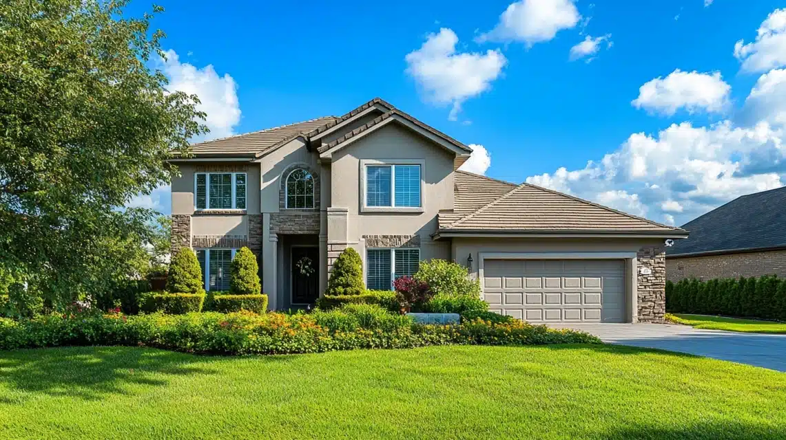
Yes, you can even use Accessible Beige outside! It’s an excellent choice for exteriors because it feels grounded and natural without being too dark or too light. Whether you’re painting your siding, trim, or even your front door, this hue works across different architectural styles.
Accessible Beige stands up well to the elements and looks stunning in both bright sun and cloudy weather. Pair it with crisp white trim for a classic look, or go bold with a black door and shutters for added sophistication.
Lighting and Accessible Beige

Lighting plays a huge role in how Accessible Beige will look in your space. In rooms with a lot of natural light, the paint will lean more toward its beige side, creating a soft, inviting glow. In darker rooms, it may take on more gray tones, which gives it a cooler and more modern appearance.
The direction your room faces can also impact the color. South-facing rooms tend to enhance the warmth of Accessible Beige, while north-facing rooms might bring out its more muted, grayish side. Always test the paint in different areas of the room before committing, especially under varying lighting conditions.
The Undertones of Accessible Beige
Undertones can make or break your color scheme, and Accessible Beige has some of the most subtle yet impactful undertones out there. It features a balanced mix of gray and brown, with just a whisper of green. This green undertone is what helps it avoid looking pink or yellow, which are common pitfalls with other beiges.
Because of its unique undertone combination, Accessible Beige pairs well with a wide range of colors. Think muted greens, soft blues, and warm whites. These complementary shades enhance its earthy character and make for a well-rounded, grounded space.
Complementary Colors for Accessible Beige
Accessible Beige isn’t just a stand-alone star—it plays incredibly well with others. Here are a few colors that beautifully complement it:
| Complementary Color | Description |
|---|---|
| Alabaster | A soft white that keeps things bright and fresh |
| Urbane Bronze | A deep, moody tone that adds contrast |
| Sea Salt | A cool green-gray that brings balance |
| Pure White | A clean white for trims and ceilings |
| Comfort Gray | A cool gray that adds subtle depth |
These combinations can be used in various ways—from trim and cabinetry to textiles and accessories. Mixing these colors with Accessible Beige creates spaces that feel harmonious, elegant, and effortlessly put-together.
Quotes from the Pros
“Accessible Beige is my go-to for creating timeless interiors that feel both warm and sophisticated.” — Interior Designer, Jenna Riley
“It’s the kind of color that makes a room feel complete without trying too hard.” — Real Estate Agent, Michael Trent
“If you’re not sure where to start with neutrals, Accessible Beige is always a safe and stylish choice.” — Color Consultant, Lisa Monroe
FAQS about Accessible Beige
What kind of paint is Accessible Beige?
Accessible Beige is a warm neutral paint color by Sherwin-Williams that blends gray and beige tones, leaning more towards beige.
Is Accessible Beige warm or cool?
It’s a warm neutral, but thanks to its gray undertones, it doesn’t come off as overly yellow or golden.
Can I use Accessible Beige in a small room?
Absolutely. Its light to mid-tone value can actually make small rooms feel bigger and more open, especially when paired with white trim and good lighting.
What trim color goes best with Accessible Beige?
Pure White or Alabaster from Sherwin-Williams work beautifully for trim and ceiling colors.
Does Accessible Beige go with gray furniture?
Yes, it does! The gray undertones in the paint allow it to complement gray furnishings very well.
Is Accessible Beige outdated?
Not at all. While it’s been popular for years, its balanced tone and versatility keep it feeling fresh and current.
What flooring works with Accessible Beige?
Wood flooring, especially light to medium tones, pairs wonderfully. It also works with tile, laminate, and even patterned rugs.
Conclusion: Is Accessible Beige Right for You?
If you’re looking for a paint color that’s flexible, timeless, and universally flattering, Accessible Beige should be at the top of your list. It’s one of those rare neutrals that works in almost any room, with almost any decor. Its balanced undertones, inviting warmth, and modern sensibility make it a go-to choice for designers and homeowners alike. Whether you’re painting one wall or your entire house, Accessible Beige offers a subtle yet stunning backdrop that lets your personality and style shine through.


